

Image Split
Documentation
Latest update on 24.03.2026
1. Overview
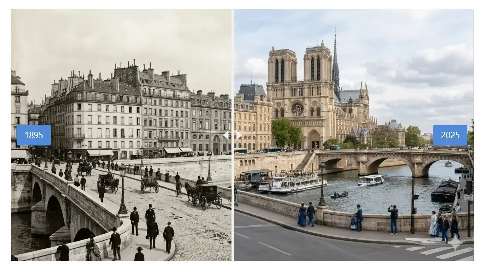
This page explains how to install, configure, and use the Image Split WordPress plugin. Image Split shows before and after image comparisons with a draggable ruler visitors can move with a mouse, touch, or keyboard. It is designed to stay lightweight, work in posts and widget areas, and respect accessibility (keyboard use and ARIA where applicable).
Free version: Gutenberg block (posts and block-based widget areas), shortcode [image_split], and site-wide defaults under Settings → Image Split.
Premium version: Adds WooCommerce integration (before/after on the single product page) and an Elementor widget, plus the same customization options at product or layout level.
If you need help, use the plugin’s support forum on WordPress.org or the contact options on Pluginarium.
2. Getting started
2.1 Installation and activation (free)
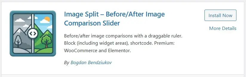
Installing from the WordPress plugin directory
- In the WordPress admin, go to Plugins → Add New Plugin.
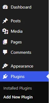
- Search for Image Split.
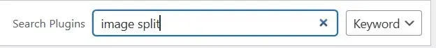
- Click Install Now, then Activate.
Uploading the plugin manually
- Download the plugin ZIP from the WordPress plugin directory or from Pluginarium.
- Go to Plugins → Add New Plugin → Upload Plugin.
- Choose the ZIP file, click Install Now, then Activate.
2.2 Installation & Activation (Premium version)
After activation, copy and paste the license key from the email. You can do that on the Settings page of the plugin (Settings -> Image Split):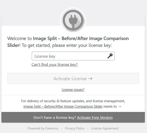
Navigate to the checkout page of the Image Split Premium plugin:
https://checkout.freemius.com/plugin/12318/plan/20929/licenses/unlimited/
The link above is also available in the Free version, when you navigate to Settings -> Image Split -> Upgrade tab: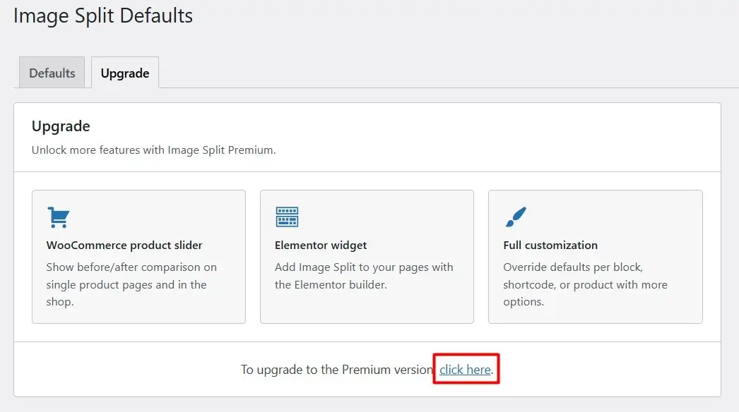
Select desired billing plan (annual or lifetime) and complete the checkout process.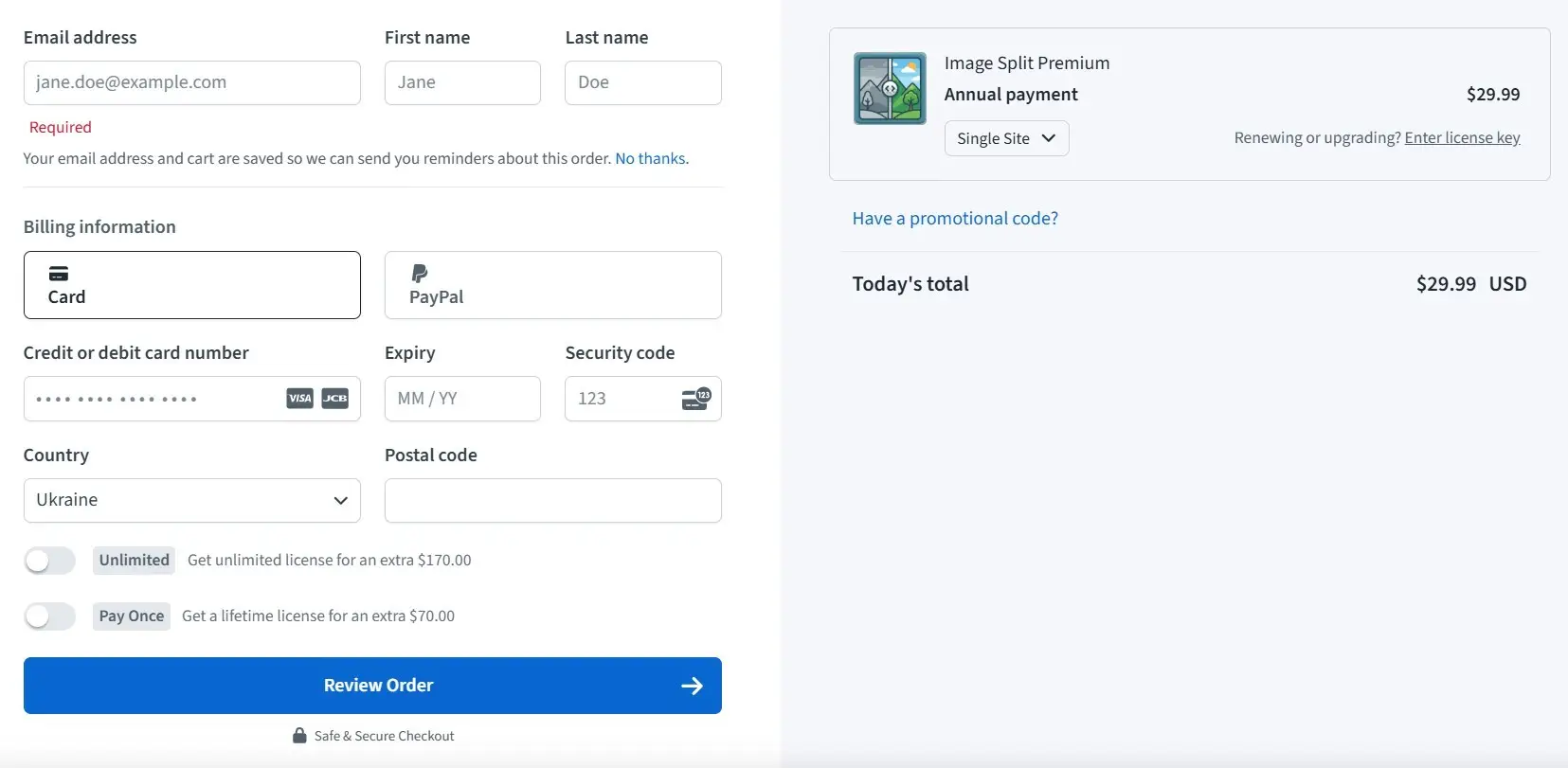
After payment, you will receive a confirmation email with the download link and license key.
Save the Premium’s version ZIP file (image-split-premium-latest.zip) to your computer. You can do that by clicking on the download link in the email (Download the plugin’s Premium version).
Install the Premium version by navigating to Plugins > Add New Plugin > Upload Plugin.
Upload the ZIP file and click Install Now.
Activate the Premium version of the plugin after installation.
3. Plugin usage
No global configuration is required. You can add comparisons with the block or shortcode right away. Optional Settings → Image Split defaults apply to new sliders unless you override them in the block, shortcode, WooCommerce product, or Elementor widget.
3.1 Gutenberg block
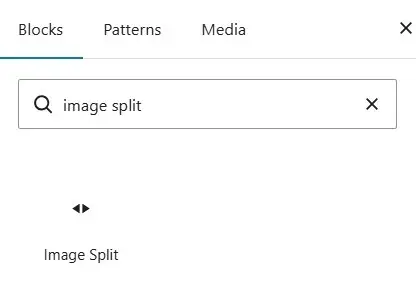
Image Split registers a block named Image Split (image-split/slider). After activation, open the block inserter, search for “Image Split”, or browse the Widgets category — the block is available without running any local build tools.
Typical workflow
- Log in to WordPress and edit a post or page (or a block theme template if your theme supports it).
- Open the block inserter (+) and add the Image Split block.
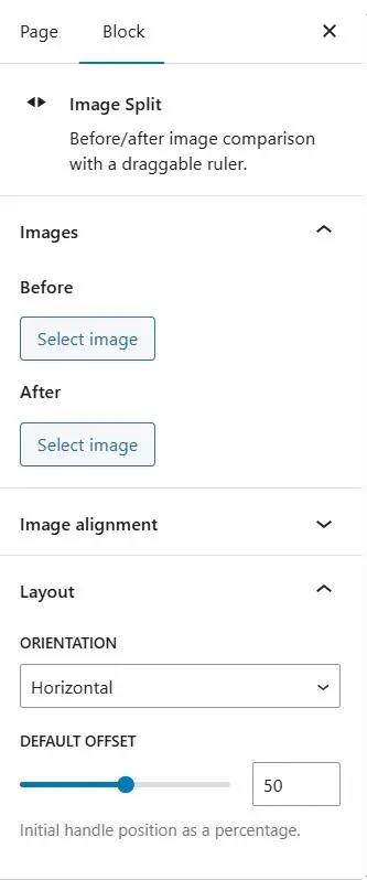
- In the block sidebar (and toolbar where applicable), choose:
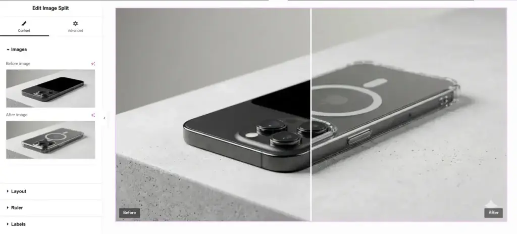
- Before and After images from the Media Library.
- Orientation: horizontal or vertical.
- Initial position of the ruler (offset).
- Ruler: style (solid, double, dashed), optional center arrows (none, triangles, arrows, chevrons), color, thickness, arrow size.
- Labels: text, positions for Before and After, colors, background, font size.
- Image alignment / base image: which image defines the frame and how the other is cropped (
object-positionpresets); Base image sets which side defines the slider frame when aspect ratios differ.
- Use block alignment (Wide / Full) if your theme supports it.
- Save or Publish.
The block supports the same options as the shortcode (see 3.3 Shortcode) under different labels in the editor.
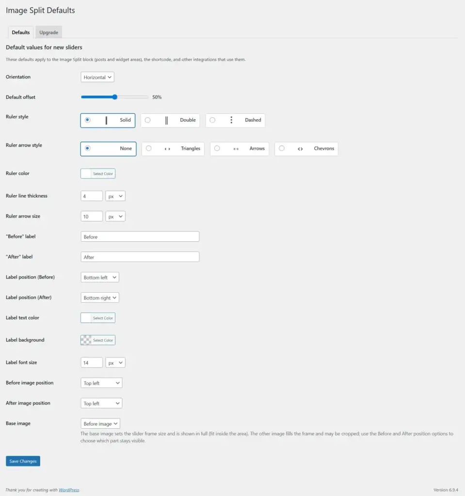
3.2 Global defaults (Settings)
Go to Settings → Image Split to set default values for new sliders. These apply to:
- New Image Split blocks (until you change options per block),
- The
[image_split]shortcode when you omit optional attributes, - Premium: WooCommerce product options and Elementor widget, where not overridden.
Options include orientation, default offset, ruler style and arrows, ruler colors and sizes, label text and positions, label styling, per-image object position, and Base image (which attachment sets the frame when aspect ratios differ). Save the settings page after changes.
3.3 Shortcode
Use [image_split] anywhere shortcodes run (post content, some page builders’ shortcode widgets, etc.).
Minimal example (two media library attachment IDs are required for output):
[image_split before="123" after="456"]Example with common options:
[image_split before="123" after="456" orientation="horizontal" offset="0.5" ruler_style="solid" ruler_arrow_style="chevron" ruler_color="#ffffff" ruler_width="4" label_before="Before" label_after="After" label_position="bottom-left" label_after_position="bottom-right" label_color="#ffffff" label_bg_color="rgba(0,0,0,0.5)" label_font_size="14" object_position_before="center center" object_position_after="center center" base_image="before"]Attribute reference
| Attribute | Description |
|---|---|
before | Required. Attachment ID for the “before” image. |
after | Required. Attachment ID for the “after” image. |
orientation | horizontal or vertical. Default from global settings. |
offset | Ruler position from 0 to 1 (e.g. 0.5 = middle). Default 0.5 or from settings. |
ruler_style | solid, double, or dashed. Older values such as line, bar, or circle are accepted for backward compatibility and are treated like a solid line. |
ruler_arrow_style | none, triangle, arrow, or chevron — decorative markers at the ruler center. |
ruler_color | Ruler color (hex or supported CSS color). |
ruler_width | Ruler thickness (numeric; unit follows global defaults). |
label_before, label_after | Label text. Empty string can be used to hide a label (behavior matches the block). |
label_position | Before label: top-left, top-right, bottom-left, bottom-right, center-left, center-right. |
label_after_position | After label: same options as label_position. |
label_color, label_bg_color, label_font_size | Label text color, background (including rgba), and font size (numeric; unit from defaults). |
object_position_before, object_position_after | CSS object-position presets such as top left, center center, or a pair like 50% 30% when supported. |
base_image | before or after — which image sets the slider frame and is shown in full; the other fills and may crop. |
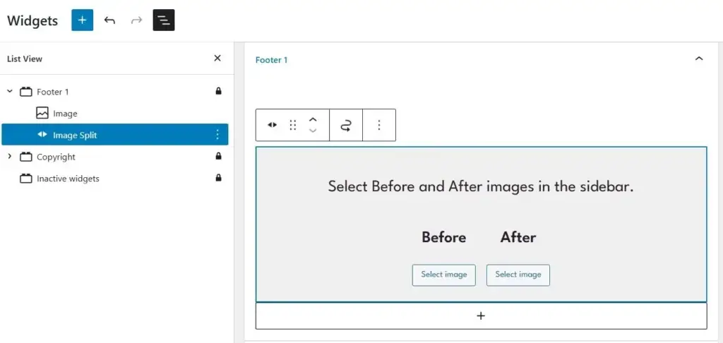
3.4 Widget areas
With a block-based theme and the block editor for widgets (Appearance → Widgets or Appearance → Editor depending on setup), you can insert the Image Split block in sidebars and footers like any other block. The same block options apply; global defaults from Settings → Image Split apply until you change them for that block instance.
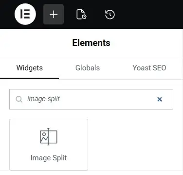
3.5 Elementor widget (Premium)
If Elementor is active and you use Image Split Premium:
- Edit the page with Elementor.
- Add the Image Split widget (search “Image Split” or look under General / Media).
- Under Images, set the Before and After media.
- Under Layout and related sections, set orientation, initial ruler position, ruler and label options — aligned with the block and shortcode.
- Use Elementor’s Style and Advanced tabs for spacing and layout as usual.
3.6 WooCommerce (Premium)
With WooCommerce and Image Split Premium:
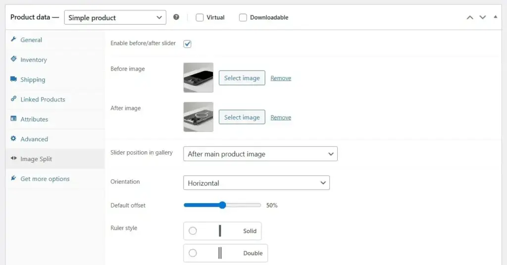
- Edit a product.
- Open the Image Split tab in the product data panel (alongside General, Inventory, etc.).
- Enable before/after slider.
- Choose Before and After images (Media Library). If you leave an ID empty or use
0, the plugin can fall back to gallery images: it uses two gallery images when available, or the featured image plus the first gallery image when that fits the gallery state. - Adjust slider options in the same tab (same fields as global defaults: ruler, labels, object position, base image). Product-specific values override Settings → Image Split for that product.
- Save the product.
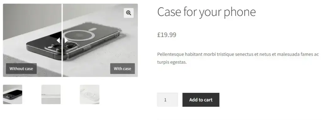
On the single product page, when enabled, Image Split replaces the first gallery image output with the interactive slider while keeping gallery thumbnail behavior coherent.
4. Support and contact
- Visit WordPress Support Forum.
- Have a feature request? Let me know via feedback form.
Table of Contents
Ready to try?

Keep in touch
Have a thought, complain or request?
Submit a form below.